Running an ecommerce brand? Here's something you already know: most people who come to your site aren't buying.
So you work hard, you get those first time customers, and you build your email list. What's next? You deploy the most amazing campaign email annnnnd crickets. When that happens, many online retailers opt to SEND MORE EMAILS.
Before you open the floodgates, think about your customer. They are already getting peppered with more emails than they can handle, so read the room. Will pushy browse abandonment emails help ‘em or hurt ‘em?
Let’s make one thing clear. This article isn’t a hit piece. Browse abandonment emails do work - check out this chart from the experts at Klaviyo:
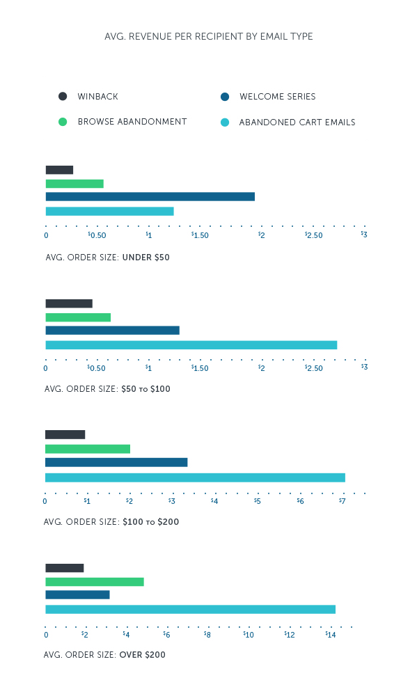
Based on those numbers, if you skip browse abandonment in your email marketing strategy, you are leaving money on the table. So we say don’t skip them, just do them right (instead of spamming customers to oblivion)!
In this post, we’ll hit you with five browse abandonment best practices that’ll help you land repeat customers without burning any along the way.
What is browse abandonment (and what brands get wrong)
By now, you must have heard about cart abandonment emails. Browse abandonment is like its younger (and sneakier) cousin. They are both based on a similar premise: the customer was on your site, abandoned ship, and did not make a purchase.
The main difference with browse abandonment is that the customer did not add a product to their shopping cart. That may not sound like much, but it’s a huge data point. When customers add something to their cart, it means they had some level of intent to buy.
Browse abandonment is a little less black and white. Brands sometimes send emails to customers who view a product page or product category. The most common execution is to send an email along with an image of the specific product they viewed as a nudge to consider buying it.
If you went to Google and searched for ideas around browse abandonment messaging & email examples, you’ll find many of the same elements suggested:
- Product images
- Urgency or scarcity messaging
- A call to action
While the stats prove browse abandonment emails can work, I have to wonder… Are they always a good idea? My inbox says no - I’m getting way too many emails as it is!
And as a customer, it also makes me feel kind of icky to know I’m being tracked so much on every ecommerce site I visit. When customers feel icky, it complicates how they feel about the brand as a whole.
Let me be clear, I don’t think we should “abandon” the idea of browse abandonment emails. But I do think brands should dial into a different approach. Browse abandonment can be a very powerful tool when it works FOR your brand instead of AGAINST it.
With all that in mind, let’s look at some best practices to humanize your approach to abandoned browse emails.
Browse abandonment best practices that consider the customer
Marketers have a tendency to look at email recipients like a bunch of numbers & percentages. Do me a solid and check your pulse - ohhhh that's right. You are human. And so are your customers!
So yes, browse abandonment flows & emails can give your Shopify store a boost, but they can also be annoying & spammy. We talked about this in our post about the best Klaviyo flows too: there's a fine line between helping and stalking.
If you are interested in leaning into being helpful, here are 5 ways to do that with your browse abandonment emails:
- Don’t remind people they are being tracked
- Make your emails more personalized
- Don’t lie about scarcity
- Try to avoid bait and switch subject lines
- Don’t add to the noise
1. Don’t remind people they are being tracked
Nothing says I love you like being followed… uhhh that’s not right.
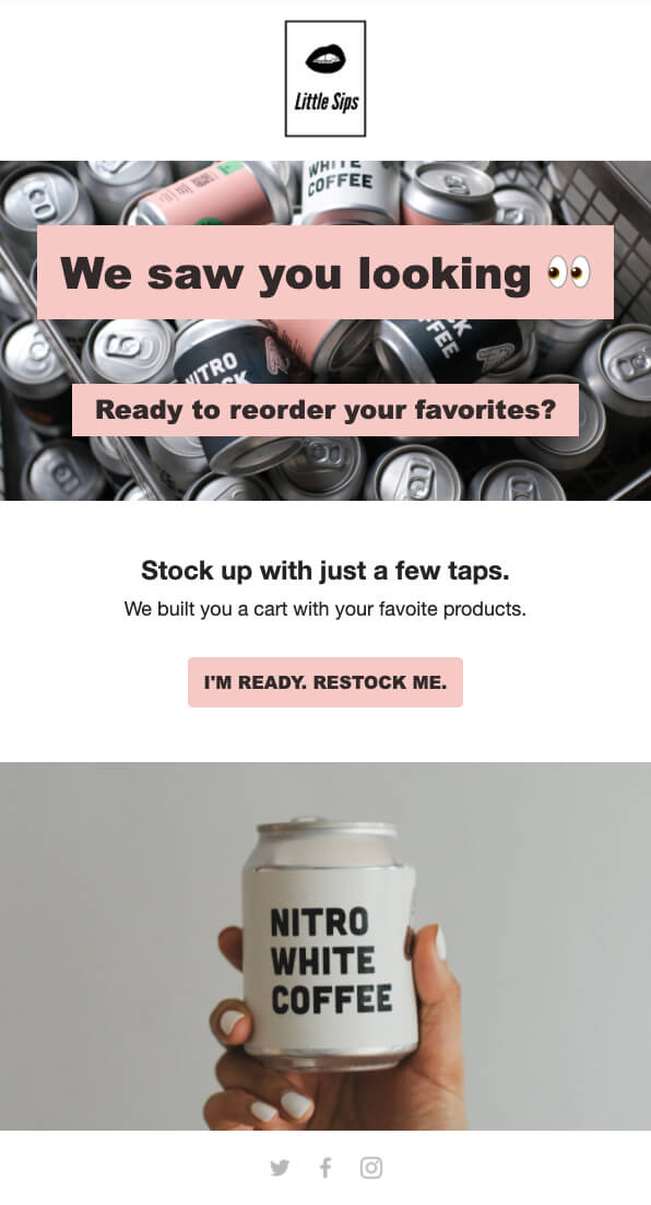
What are people supposed to think when you send them an email saying “we see you”? The only time this makes sense to do is when we actually want to be seen.
There’s an argument for building complex automations and tracking to figure out the right time to send those emails, but we say skip that and use a more conventional approach. If the customer is thirsty, offer them a drink.
Using Repeat (that’s our reordering app for Shopify), we can determine when customers are in the optimum reorder window. And if they are, and they are browsing the site, then they might actually want to see an email like this:
2. Make your emails more personalized
Most examples of browse abandonment emails you find online are generic. Unless you’re offering a sweet discount, I can’t think of any reason why those emails would work.
Even still, the discount is a hack to get people into the routine of buying from you. But since that routine is based on a cold and calculated sales strategy, rather than a personal connection to the brand, it might be missing the target.
What do you think will convert better:
- A generalized discount offered as bait?
- Product recommendations based on their purchase history?
We want people to think of our brands when they have a problem, i.e. “My skin is dry, I should reorder that moisturizer”. That’s always going to be better than customers only buying when a discount is offered.
Here’s an example of an email that you can send to potential customers who have browsed product on your site but have not yet purchased. Introduce them to an easy & personalized reordering experience:
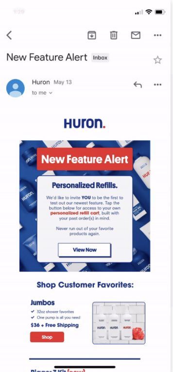
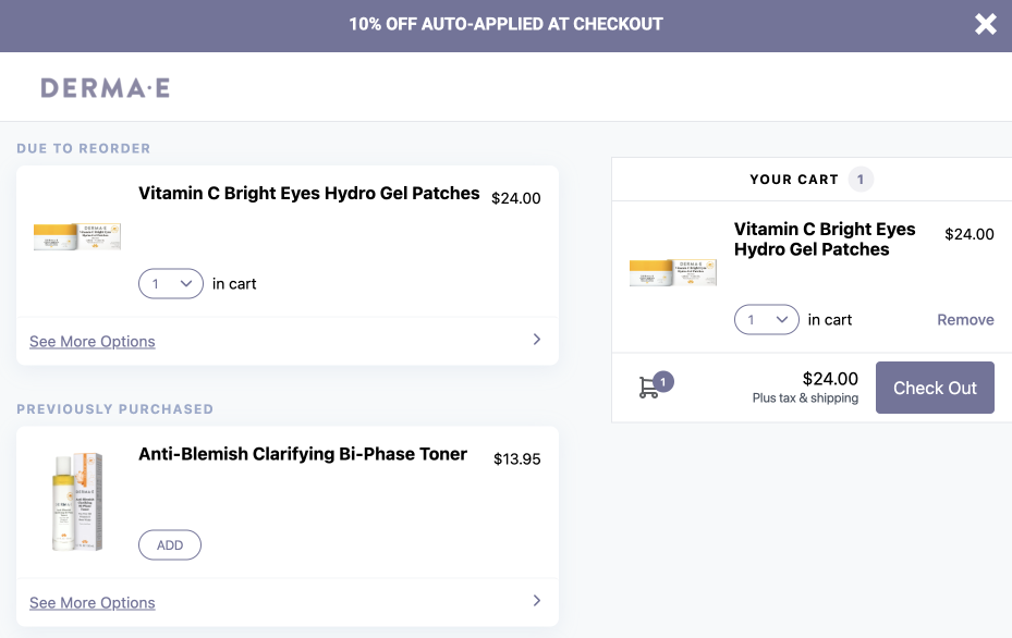
The above email directs customers to a personalized & preloaded Repeat shopping cart that lets them easily reorder exactly what they need. It’s based on two main factors:
- What products the customer has previously purchased
- Whether or not they are due to reorder
To build that into any email (including browse abandonment ones), all you need to do is install our Klaviyo integration and insert a Repeat Cart URL into the email.
If you’re curious, here’s what a Repeat cart by DERMA E looks like. In this example, the customer bought some hydro gel patches, which they are due to reorder:
3. Don’t lie about scarcity
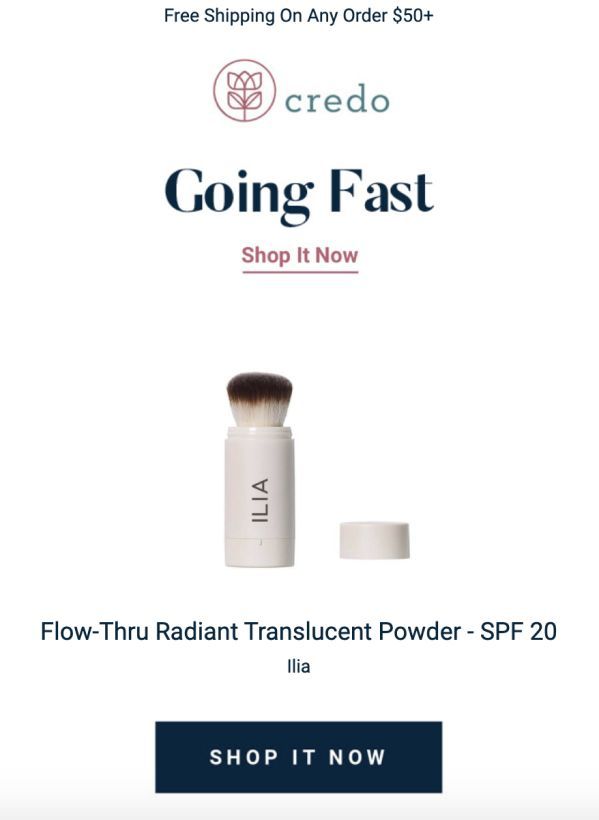
Here’s something customers know: you are lying about scarcity.
Ok well, it’s not like you are always lying, but let’s be real - sometimes you are. And unless you are making limited run products a major part of your business, it’s not a good tactic to rely on.
Do you want your customers to live in fear, or live in love? Scarcity forces people to make snap decisions because they are afraid of missing out. That’s a tough precedent to live up to in the long term.
With browse abandonment emails, you are assuming intent to buy based on the user browsing your online store. While you should never lie about it, the scarcity play makes a lot more sense when purchase intent is clearer, as is the case with cart abandonment.
Instead of the scarcity angle, think of reasons why product abandonment might be happening. Rather than scare people, first try offering help, improving product pages, or cross selling.
4. Try to avoid bait and switch subject lines
Email marketers will be the first to admit it. They are actively trying to rig the game in their favor. The trouble is that the rules of the game are being bent far too often.
It’s a difficult situation to reconcile. When sending browse abandonment emails, open rates are the key data point. And the subject line is a huge part of what gets people to click through and open an email.
So yes, it’s easy to see why it’s so tempting to pump out cute subject lines designed to get people back on your site. But don’t forget that customers are getting wise to this.
That means it won’t be long before a subject line like “We noticed you noticing us” will be completely ignored. And if your emails are routinely not opened, spam filters will become a major problem for your brand.
5. Don’t add to the noise
We got into this topic during a great podcast episode with Rviita's Mitch Jacobsen. To put it bluntly, brands are sending way too many emails. And it’s getting noisy.
No kidding. For me, it’s so bad that I don’t want to sign up for any email list from any brand, person, whatever. I’m burned out on email big time. And I’m a marketing guy who thinks email is a great tool (and I’ve used it to get really great results).
So yea, the squeaky wheel gets the grease… but it also makes people want to unsubscribe from your email list. Set up an aggressive browse abandonment flow and you might be headed in the wrong direction.
All that isn’t to say that browser abandonment should be completely ignored as an opportunity, but it needs to be considered as part of the grand scheme of your email efforts.
If you’re a CPG brand doing DTC, we’d love to show you how your browse abandonment emails can be turned into reordering machines. 👋 We’re Repeat, the reordering app used by brands like Huron, Lemon Perfect, and Blume. Join us! Book a demo now to learn more.


